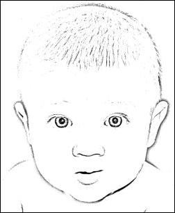
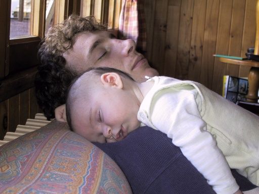
Hello Bar

Monday, April 30, 2007

Gold Plated Effect

Choose your preferred picture for converting it's colors into golden sun color shades.

Prepare the Photo

black woman photo Prepare the image before applying this stylizing effect. Smooth, blur or remove photo details like tiny hair streaks, small shadows, skin spots and goose pimples to avoid unnecessary appearance of this details in the converted, stylized image.
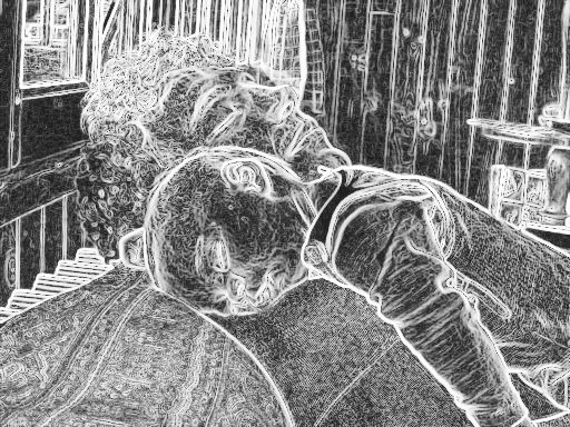
Picture coloring

blue woman image 
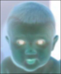
Dyeing the image can reduce pixel noise in the later editing. Use the Filters » Colors » Colorify -filter of Gimp for coloring the picture in Cyan tones, shades of Green or in the hue of Yellow.

Different coloring tones will result in different stylizing effect in the image. Gimps.de prefers the soft Cyan or tea Green pastels for color photo portraits and Yellow for graphics and cliparts.

Tip: Intelligent woman will try different colors for coloring the image and choose afterwards the best result for this photo stylizing effect of Gimps.de.

Convert colors into Gold

gold woman picture 
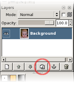
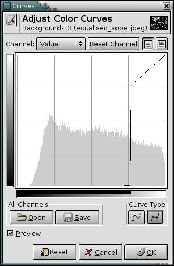
Choose the golden gradient to use this gradient for converting the colors of the picture. Use Filters » Colors » Map » Gradient Map -filter of the Gimp to convert all color in the image into shades of Gold.

Tip: Smart woman may also want to try other gradients like purples, greens or pastels to see colorful cool effects on their goldfish photos.

Tips for further editing

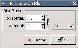
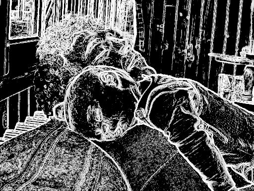
Converting the image into gold shaded colors may produce the famous pixel noise effect. Use the Filters » Blur » Selective Gaussian Blur -filter of the Gimp to polish the pixel noise in the picture.

After bluring the pixel noise, nifty expert woman may want to sharpen the image. Use the Filters » Enhance » Unsharp Mask -filter of the Gimp to enhance the sharpness of shapes and contours within the picture.

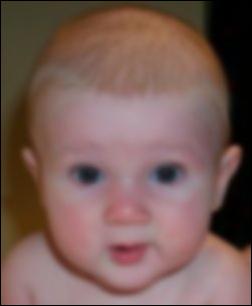
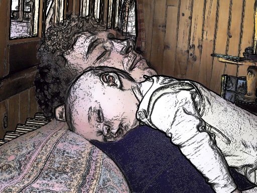
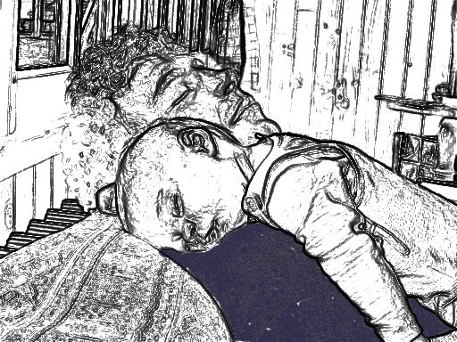
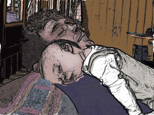
You may also want to use other Gimp tutorials of Gimps.de to improve colors, brightness, saturation and hue in the converted image.
black woman photo gold woman picture
A photo before and after editing with Gimp.

High Pass Filter Sketch Effect (GIMP)

Text and images Copyright (C) 2004 Vidar Madsen and may not be used without permission of the author.

Meet Marius, my son. :)

Before:
After:

1. High pass filtering

High pass filtering means that we filter away the low frequencies of something, and let the high frequency bands pass. In image terms, this means that the detail of an image is kept, while the larger scale gradients are removed. Luckily, it's not as complicated as it sounds.

First, duplicate the layer.

Then Gaussian Blur the top layer with an appropriate radius.

You need to experiment to find good values, but roughly speaking one can say that the larger the radius, the wider the high pass filter's frequency response, and the "fatter" the lines in the final sketch. In this example I used 7 pixels, giving this result;

Now we have a low pass filtered version of our image; all gradients and no detail. Exactly the opposite of what we wanted. So, how do we obtain a high pass filtered version? Why, we subtract it from our original, of course. A good way to do that is to simply Invert the image, and blend it 50-50 with the original. First, Image->Colors->Invert;

Then, to blend the two, we adjust the Layer's Opacity slider to 50%, and our high pass filtered image appears;

Now it's time to Merge the two layers, so that we can continue to process them as one. Right-click on the top layer and pick Merge Down.

Now, back to the image. Was the effect a bit too subtle, perhaps? While not necessary, we can apply the Levels tool (Layer->Colors->Levels) to increase the contrast a bit, so that it's easier to inspect visually. In this example, I set Input Levels to 100-155;

2. The sketch part

Now it's time to make the image background white. First, Layer->Colors->Desaturate the image, and fire up that Levels tool again. Here you need to experiment a bit to find the best values for your image. But you will most likely want to set max Input Level (the right value) to 128 or thereabout. This makes the 50%-grey part of the image go white, which is a good start. (If you look at the Levels histogram, you should notice a strong peak in the middle. This is where we want the Max Input Level.)

The primary target of experimentation would be the gamma value field in the middle (the grey triangle just below the histogram). With a bit of tweaking, you could end up with something like this;

That's pretty much it. I tend to want to hand-polish my images to get rid of various imperfections, though. Below is the result of softening the contrast on the lower right region, which is where the bright skin fell against the black background; The higher the contrast, the stronger the lines. I also fine-tuned the overall contrast (with Levels) to get rid of some of the noise in the face;

Finally I wanted to remove the annoying shadow below his chin and some of the specks scattered around his face, so I manually hand-brushed away parts of it, giving the final result;

Voila. That's it. Hope you liked it. :)

Photo to Sketch

Tutorial on how to make a nice baby & daddy photo into a nice baby & daddy painting.

Text and images Copyright (C) 2002 Dave Neary and may not be used without permission of the author.

1. Original image

Nice picture of a baby & dad. Ah.

2. After a Sobel edge detect

Straightforward Sobel edge detect ( Filters -> Edge-Detect -> Sobel) of original (don't forget to save a copy of the original) The Sobel edge detect should be done on the background image (without an alpha channel) rather than a copy of the background (which has an alpha channel).

3. Equalised & desaturated Sobel

Bring out detail with an auto-equalise ( Layer -> Colors -> Auto -> Auto-Equalize) of the sobel edge detect, and convert it to greys using desaturate ( Layer -> Colors -> Desaturate).

4. Curves window for how to do a highpass filter

We only want the strong edges, otherwise it'll look crap. To get them, we eliminate the edges with small magnitude. The easiest way to do this is with the curves tool ( Image -> Colors -> Curves) like this.

We set the curve type to free (which allows discontinuities), and then for the bottom 3/4 of the curve (or thereabouts) to 0. Just drag the mouse/pen along the bottom of the curves tool.

5. Image after the highpass

The result is much cleaner. The only problem is it's white-on-black, when we want black-on-transparent ideally.

6. L&C dialog for creating an edges mask

Small trick to get to black-on-transparent. Invert the Sobel edge detect (you did keep a copy, right?) with Layer -> Colors -> Invert and apply our highpass-filtered copy as a mask. To do this, open the Layers & Channels dialog (if it's not open already), and add a layer mask to the layer with the inverted edge detect layer ( Edit -> Copy with the highpass layer selected, Add Layer Mask with the inverted edge layer selected, then select the mask and Edit -> Paste) Since we kept the strong edges in the highpass filtered layer, this means that we end up with a rather nice black-on-transparent layer.

7. Save of the image above to show effect

This is the result of the trick above. It's shown here with a white layer behind it. We could stop here, and this is a decent sketch effect. For the colouring, we need some more work (mostly slogging, though).

8. L&C dialog with set-up for the colouring trick

images,original image & colouring layer in overlay mode

We put our original image back in the background, and set the white layer to overlay (as we see here) - this means we can see the coloured areas behind the white layer - this is extremely helpful when we're painting the white layer, as sometimes the edges are rather fine, or are in the middle of an area that's more or less the same colour.

9. Colouring looks after doing one area of the image

Using the colour-picker tool (looks like an eye-dropper), we select the colour we want to paint from the original image (just activate the "original image" layer and try to pick a colour representative of an area), and then we re-activate our colouring layer, which is still in overlay mode. Using a big brush (with the brush tool for more natural edges) we fill in the area of that colour roughly (doesn't have to be perfect). You should see the colour darkening as we draw with a colour similar to the background colour.

10. Colouring layer in normal mode

This is what we see if we set the colour drawing layer to normal mode. And we're on our way.

11. Finished with a completed colour layer

After some effort, all the regions get filled in. Final touches to make faces and the like look better for shadows and highlights were accomplished by selecting a representative shadow/highlight colour, and adding the extra bits with the airbrush tool (looks like an airbrush). After all our work, we end up with this very nice looking painting effect.

Sunday, April 29, 2007

Adjusting Brightness and Contrast

The most powerful approach to adjusting brightness and contrast across an image, for more expert GIMP users, is to create a new layer above the one you are working on, and then in the Layers dialog set the Mode for the upper layer to “Multiply”. The new layer then serves as a “gain control” layer for the layer below it, with white yielding maximum gain and black yielding a gain of zero. Thus, by painting on the new layer, you can selectively adjust the gain for each area of the image, giving you very fine control. You should try to paint only with smooth gradients, because sudden changes in gain will give rise to spurious edges in the result. Paint only using shades of gray, not colors, unless you want to produce color shifts in the image.

Actually, “Multiply” is not the only mode that is useful for gain control. In fact, “Multiply” mode can only darken parts of an image, never lighten them, so it is only useful where some parts of an image are overexposed. Using “Divide” mode has the opposite effect: it can brighten areas of an image but not darken them. Here is a trick that is often useful for bringing out the maximum amount of detail across all areas of an image:
  1. Duplicate the layer (producing a new layer above it).
  2. Desaturate the new layer.
  3. Apply a Gaussian blur to the result, with a large radius (100 or more).
  4. Set Mode in the Layers dialog to Divide.
  5. Control the amount of correction by adjusting opacity in the Layers dialog, or by using Brightness/Contrast, Levels, or Curves tools on the new layer.
  6. When you are happy with the result, you can use Merge Down to combine the control layer and the original layer into a single layer.
In addition to “Multiply” and “Divide”, you may every so often get useful effects with other layer combination modes, such as “Dodge”, “Burn”, or “Soft Light”. It is all too easy, though, once you start playing with these things, to look away from the computer for a moment and suddenly find that you have just spent an hour twiddling parameters. Be warned: the more options you have, the harder it is to make a decision.

From GIMP manual

Jumping Out of Frame

Here is a cool photoshop trick you may have seen before. Take a photo and make it pop out. It is something I've always thaught looked really cool. Well after seeing one on the net again today it inspired me to make one for myself:

external image finalresult.jpg

Now, here is a quick and dirty guide on how I did it.

Take your starter image. Once you have tried this once you will find it easier to pick a source image that is going to work well.

external image guide0.jpg

Firstly sort out your layers. Set a black background with your source image above that on a new layer, and have a blank layer on the very top. On your top layer you need to make a rectangular selection which will form the outer edge of your frame. Place it and size it so that it is over a portion of the picture and make sure the part of the picture you want to jump out is outside the selection. Fill it in white.

external image guide1.jpg

Once this is done you want to keep the selection and choose Select - Modify - Contract and use an input of around 50 and accept. Press delete and you will have your border in place. CTRL + D to deselect.

external image guide2.jpg

Now for perspective. Firstly you want to press CTRL + T then right click and choose perspective, you can now move the frame around to achive the perspective you want. Theres no system to make this easier, basically move the frame around untill you get a perspective for it that you are happy with. Press enter to apply.

You can make final adjustments to the frame using CTRL + T then right click and choose distort. This allows you to fine tune the framing.

external image guide3.jpg

Now for the blacking out. You could use a mask on the origional layer or be quick and dirty like me and make a new layer and paint on it with black. The object of this is obviously to paint around the white frame and any part of the subject that you want to keep that is sticking out of said frame. There many methods to do this, again quick and dirty is a paint brush with feathered edges zoomed to 200-400% and slowly paint around.

To finish off the frame so it runs behind your subject go back to the frame layer, lower the opacity to 50% so you can see where the subject starts and stops, take out your eraser and erase that section of the white line, once done put the opacity back to 100% and you are done.

Here is another I prepared earlier external image wink.gif

external image guide4.jpg

Theres pleanty more you can do with this effect, adding more details outside the frames, using a white background instead and adding shadows etc. Here is an example of what can be done:

Wednesday, April 4, 2007

Glowing Photos

You might not know his name, but you've almost certainly seen photos influenced by a technique he pioneered for film photography. I'm talking about Michael Orton, the creative force behind a breathtakingly gorgeous style. Here's his process, in a nutshell: Take two photos of the same scene (one in focus and the other out of focus, both somewhat overexposed) and combine them. The result is a photograph with a beautiful, almost eerie glow, like this.

Here's the rub: I only had a single shot to make that image, so I used a digital shortcut. It took me about a minute to do it, using Corel's Paint Shop Pro--though you can use almost any image editing program. This week I'll show you how.

Layer Your Photos

Let's start with a bland photo of my son sightseeing near a lighthouse (or substitute any photo of your own).

Open this photo in Paint Shop Pro and duplicate it in a second layer by choosing Layers, Duplicate from the menu bar. You won't see a difference in the photo itself, but you should see a second layer appear in the Layer Palette on the right side of the screen. (If the Layer Palette isn't visible, toggle it on by choosing View, Palettes, Layers.)

Next, make a second duplicate layer in the same way. You should now see three layers in the palette. To keep them all straight, right-click the first layer (the one called "Copy of Background") and choose Rename, then type in Sharp and press Enter. Then rename "Copy (2) of Background" to "Blurry."

Overexpose Your Shot

Next, we'll simulate overexposing the photo. Click on Sharp in the Layers Palette and change the blending mode from the default of Normal to Screen. You can find the blending mode in the Layers Palette menu, right above the three layers. Again, you won't see a difference, because you just screened the middle layer. Then right-click Sharp and choose Merge, Merge Down. The Sharp layer will disappear, having just been merged into the original background layer.

Add the Blur

Now it's time to make the top layer blurry. Click the layer you named Blurry to select it, then choose Adjust, Blur, Gaussian Blur. The amount of blur is controlled by the Radius setting and will depend upon the size of the photo. For the fairly small sample I provided, try a setting around 9. If you're working with a larger image, say 6 megapixels, I'd start around 14 or 15. The key is to add a significant amount of blur without completely obscuring the detail.

The final step? With Blurry still selected, change the blend mode from Normal to Multiply. You should get something like this.

Feel free to experiment with alternative blur levels and blending modes. You might also want to vary the opacity of the top layer to fine-tune the effect.


I've tried this working in GIMP with great results. It's a really nice effect in portraits. I've also gotten some interesting results with Hard Light blend mode. --tab